In the realm of the senses: the colour Pink

In his classic treatise, The elements of color, Johannes Itten states that, even though the effects of colour are in the eye of the beholder, the truest secrets of colour are invisible to the eye, but beheld by the heart alone [1]. Michel Pastoreau presents a similar statement when he writes that, even though colour is a natural phenomenon, it is also a complex construct: it is society that “makes” colour, defines it, and gives it meaning [2].
That is precisely how the artist Barbara Nemitz sees blush pink—the shade of our
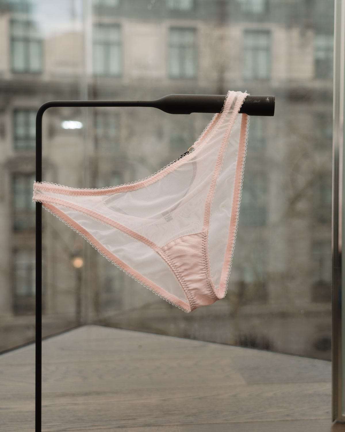
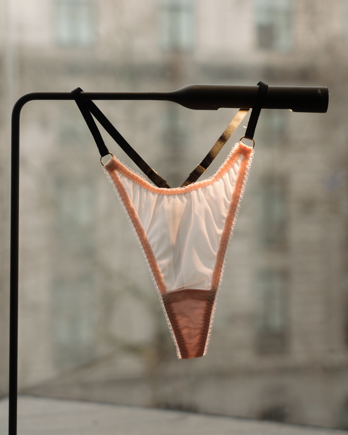
bestseller, already iconic thongs! It is assertive, no matter the context [3], a shade that is simultaneously sensitive, tender, youthful, but also artificial, unreal, vulnerable. Pink addresses our senses unlike any other colour [4], as a shade that is emotional, ambivalent, often charged with contradictory components. Derived from red, which is a warm colour full of vitality, pink is also muted by the lightness and brightness of white; that push and pull in opposite directions is the magic of this colour, which elicits our senses of closeness through touch, taste, and smell.
Pink transports us to objects that are luxurious, erotic and mysterious, always revealing more than they promise, and hiding sensations that are always more powerful and memorable than the muted, understated colour that meets the eye.
Pink can embrace many meanings: it can be shocking, “Snapchatty”, repulsive, postmodern, “problematic” and, even, quite literally divine [5].

Fra Angelico: The Annunciation (1440-1445). In the Early Renaissance, the colour blush pink often appeared associated with heavenly themes, as is the case of the angel’s robe in this portrayal of San Marco’s annunciation—pink is... divine! Image: Public Domain.
Yet, when we think cherry blossoms, peonies, and roses; the juicy insides of a lychee, or the exotic complexity of aji sashimi; Ladurée’s enigma, the “rose petal” macarons and a glass of pink champagne; rose quartz, opals, pink diamonds, and rosé gold, it is impossible to deny that light pink is charged with sensory images that are also tastes, smells, and textures that transposes us to a “rose-tinted” universe.
 The sensory universe of pink. Collage by Marilia Jardim
The History of Pink
Heide Christiansen and Martin Fraas state that pink is probably the oldest colour in the world: pink pigments were found in rock samples under the Sahara dating back to 1.1 billion (that was not a typo) years [6]! Although we associate pink with blossoms, it was already there even before plants existed on this planet. Yet, the cultural history of pink in the West goes back only a few centuries and two scientific events: the publication of Isaac Newton’s Opticks in 1704 and, two years after, the invention of the shade “Prussian blue” by the German chemist Heinrich Diesbach [7]: the first “modern colour”, meaning it was derived from an inorganic, chemically produced pigment. Fashion in the 18th century is unlike any other that came before it, not so much because of the theatrical forms of dresses (and hairdos...), but chiefly for its love of pastel shades—including blush pink!—which were only made possible by the scientific advancements of the era: Newton’s isolation of the “pure colours” of the rainbow, and Diesbach chemical invention.
One of 18th century trendiest sensations, the shade Rose Pompadour, was officialised in 1757 by the Sèrvres porcelain factory [8], who also produced tableware in this shade to sate Pompadour’s love of pink. Indeed, Madame de Pompadour—a mistress, friend, and confidant of King Louis XV, not to mention a kind of 18th-century influencer...—is credited as a defining figure in sealing pink’s destiny as a fashionable colour.
The Historian Valerie Steele also attributes pink’s success in the 18th century to the
discovery of a type of brazil-wood in the South American colonies, which yielded a
much better dye than the known Asian varieties, as well as the love of fashion and
novelty in the Parisian court [9].

François Boucher, Pompadour at her Toilette (1750), oil on canvas. Image: Public Domain.

Potpourri vase in Rose Pompadour, produced by the Sèvres Vicennes porcelain factory, part of the MET
collection. Image: Wikimedia Commons.
However, in Japanese culture, pink has a much longer history, being a fundamental
colour since the Heian court (794-1185) [10]. Since then, the colour has had many
meanings in Japan, including its association with the “Lolita subculture” appearing in the 1970s Harajuku boutiques, which merges Asian cute and Western punk in a uniquely Japanese way. In the 1930s, pink appeared in Japanese literature as part of a girly universe, connoting glamour in a fantasy world that radically transcends the reality and uncertainty of war [11]. Since the 1990s, pink has gained associations with eroticism in Japan, through its use to obscure sexual content and bypass censorship of soft-core porn videos—which are known, you guessed, as “pink films”.
Pink in Fashion
The first time “pink” appeared as a colour name in Europe was in 1828 [12], but it didn’t gain momentum as a sensation until the avant-garde works of the artist and fashion designer Elsa Schiaparelli [13]—which includes her naming of the tone between fuchsia and magenta as “shocking pink”. It always surprises people today that, from the Renaissance onwards, the more intense shades of pink were actually considered a symbol of masculinity, its vibrancy associated with male power. That meaning of pink, supported by harmonics and colour theory, echoed in the 1950s “preppy” style, originating in the US and gaining momentum in Europe in the 1980s. However, it was not until the one and only Miss Barbie and her “everything pink” world were introduced in 1959 [14] that pink gained its definitive (at least until today...) meaning as the ultimate colour for girls.
Throughout the 20th century, pink has been a favourite of fashion houses, both for clothing, accessories, jewellery and makeup. The first iconic orchid pink lipstick was introduced by Dior in 1949 [15] and, to date, that shade is associated with a certain elegance and distinction. The lighter shade of pink, on the one hand, has an eternal connection with luxury—think pink champagne, rose gold, and the long history of success of light pink gemstones used by Dior, Tiffany, Louis Vuitton, Cartier, and even Rolex. But light pink is also a statement colour and a symbol of rebellion, as is beautifully encapsulated by Valentino and Chanel in their use of this colour for bridal dresses [16] -as remarked by Barbara Nemitz, pink is a statement, a colour that forces the creator to “take a position” [17].
Think Pink!

Pantone 2016
Rose Quartz and Serenity: 2016 Pantone “Colour of the Year”. Image: Pantone.
“Pink has a more intense effect on the human psyche than other colours” [18], which is perhaps why, out of all colours, “Think Pink!” is what came to mean “to think out of the box”, to be bold, unconventional, self-confident. This marvellous family of shades has
been homaged by the American colour-matching system Pantone several times:
“Honeysuckle” in 2011, “Viva Magenta” in 2023, and “Rose Quartz” in 2016. The latter, very close to Vivi Leigh’s blush pink, is described as “a warm embrace” [19], which encapsulates the combination of emotion and eroticism our underwear aims to invoke.
Our lingerie embodies pink’s ability to progress in the direction of the passion and heat of red: it embodies suspense, longing, promise, and the hope of fulfilment [20].
Explore our blush pink collection here!
Notes
[1] Johannes Itten, The elements of color, 1970.
[2] Michel Pastoreau, Blue: the history of a color, 2001.
[3] Barbara Nemitz & Hideto Fuse, Pink: the exposed colour in contemporary art and
culture, 2006, p. 40
[4] Idem, p. 27
[5] The Cut, “Adventures in Pink, the most divisive of colours”,
https://www.thecut.com/2016/03/adventures-in-pink-the-most-divisive-of-colors.html
[6] Heide Christiansen & Martin Fraas, The Pink Book: Fashion Styles & Stories, 2024.
[7] Alexandra Loske, Colour. A Visual History, 2019, p. 11
[8] Valerie Steele, Pink: the history of a punk, pretty, powerful colour, 2018, p. 16
[9] Idem
[10] see Valerie Steele, p. 79
[11] Masafumi Monden, “The Color of the Day: Many Shades of Pink in Japan”, in:
Valerie Steele, Pink: the history of a punk, pretty, powerful colour, 2018, p. 179
[12] see Heide Christiansen & Martin Fraas, p. 13
[13] see D. E. Blum Shocking!: the art and fashion of Elsa Schiaparelli, 2003 and M. S.
Carron de la Carrière, Shocking: the surreal world of Elsa Schiaparelli, 2022.
[14] Marco Tosa, Barbie: four decades of fashion, fantasy and fun, 1998.
[15] see Heide Christiansen & Martin Fraas, p. 72
[16] see Heide Christiansen & Martin Fraas
[17] see Barbara Nemitz & Hideto Fuse, p. 26
[18] see Heide Christiansen & Martin Fraas, p. 110
[19] PANTONE. “Colour of the Year 2016”. Available at:
https://www.pantone.com/uk/en/articles/color-of-the-year/color-of-the-year-2016
[20] see Barbara Nemitz & Hideto Fuse, p. 32
References
Blum, D.E. 2003. Shocking!: the art and fashion of Elsa Schiaparelli. London: Yale
University Press.
Carron de la Carrière, M.S. (Eds.) 2022. Shocking: the surreal world of Elsa
Schiaparelli. London: Thames and Hudson.
Christiansen, H. & Fraas, M. 2024. The Pink Book: Fashion Styles & Stories. Kempen:
teNeues.
The Cut, 3rd of April 2016. “Adventures in Pink, the most divisive of colours”, available
at: https://www.thecut.com/2016/03/adventures-in-pink-the-most-divisive-of-colors.html
Itten, J. 1970. The Elements of Color. London: Chapman and Hall.
Loske, A. 2019. Colour. A Visual History. London: Ilex.
PANTONE. “Colour of the Year 2016”. Available at:
https://www.pantone.com/uk/en/articles/color-of-the-year/color-of-the-year-2016
Pastoreau, M. 2001. Blue: the history of a color. Princeton: Princeton University Press.
Nemitz, B. & Fuse, H. 2006. Pink: the exposed colour in contemporary art and culture.
Ostfildern: Hatje Cantz.
Steeele, V. (Eds.) 2018. Pink: the history of a punk, pretty, powerful colour. London:
Thames and Hudson.
Tosa, M. 1998. Barbie: four decades of fashion, fantasy and fun. London: Pavillion.
Author
Dr Marilia Jardim is a semiotician, researcher, and educator, MPhil in Communication
and Semiotics and PhD in Communications and Media. Since 2012, her research
focuses on fashion and the body and the socio-cultural narratives of dress and identity. As a lecturer, she has taught subjects on Communication, Culture, and Identity in Art, Design, and Creative Industries subjects for more than a decade and, in parallel, supported brands and businesses in branding and advertising through cultural research and commercial semiotics.


